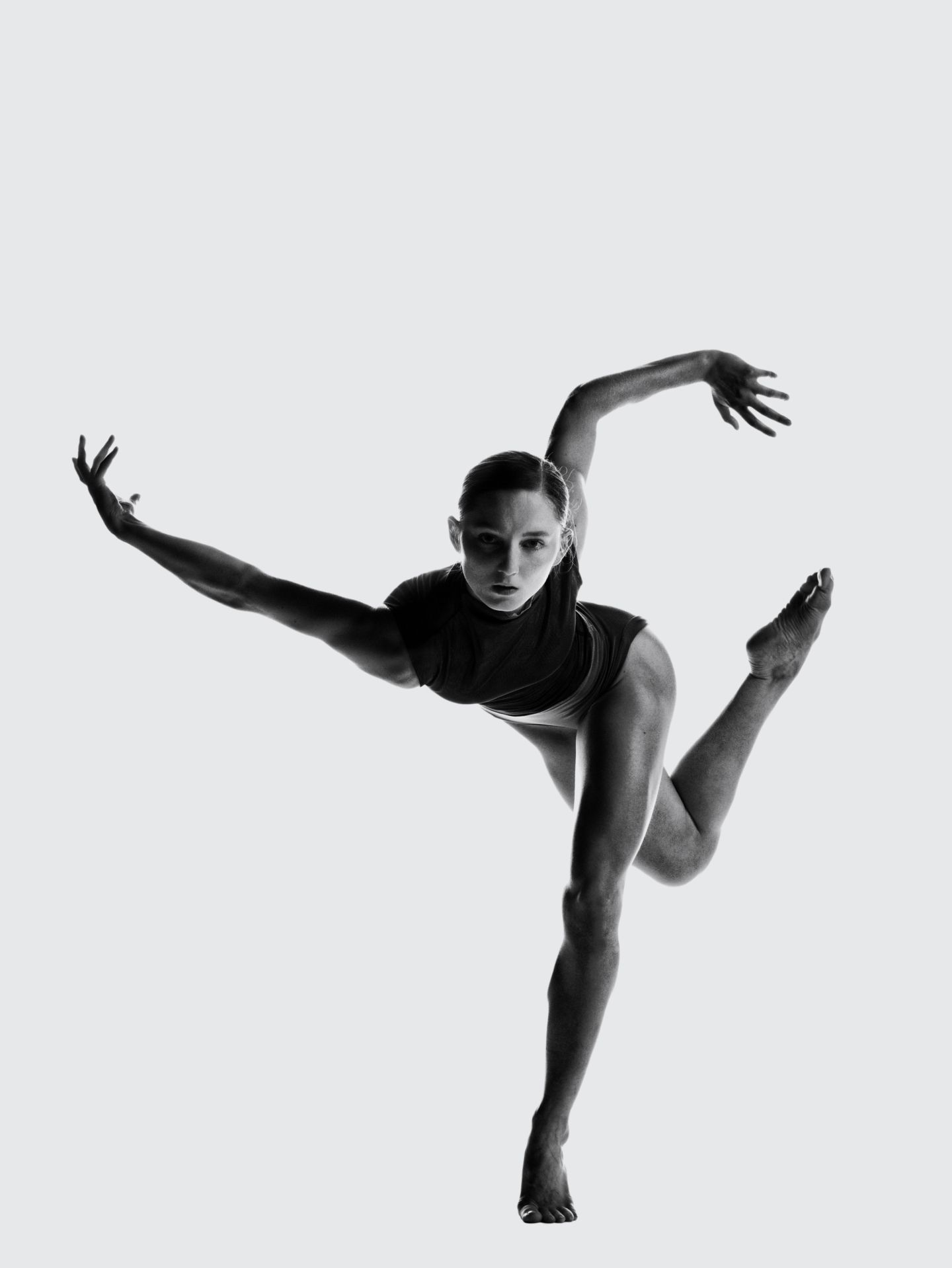
Respected world-wide for its contemporary style and innovative approach to the art form.
Ballet BC
Brand Strategy
Visual Identity
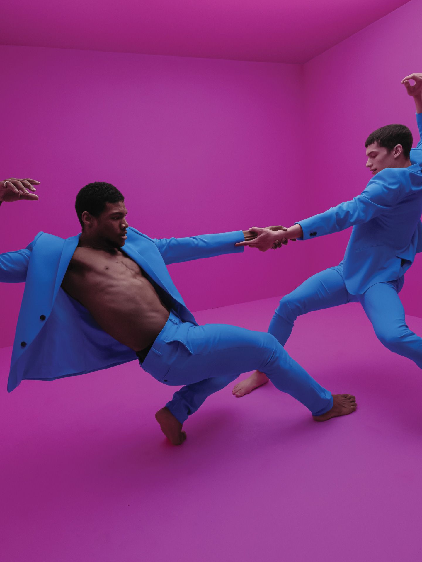
Campaign
Website


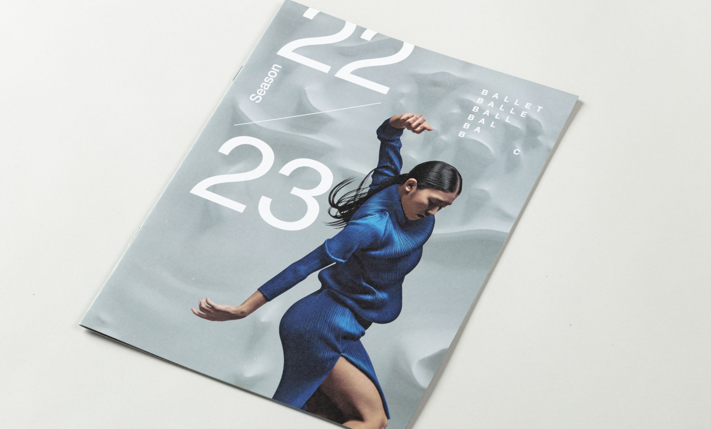
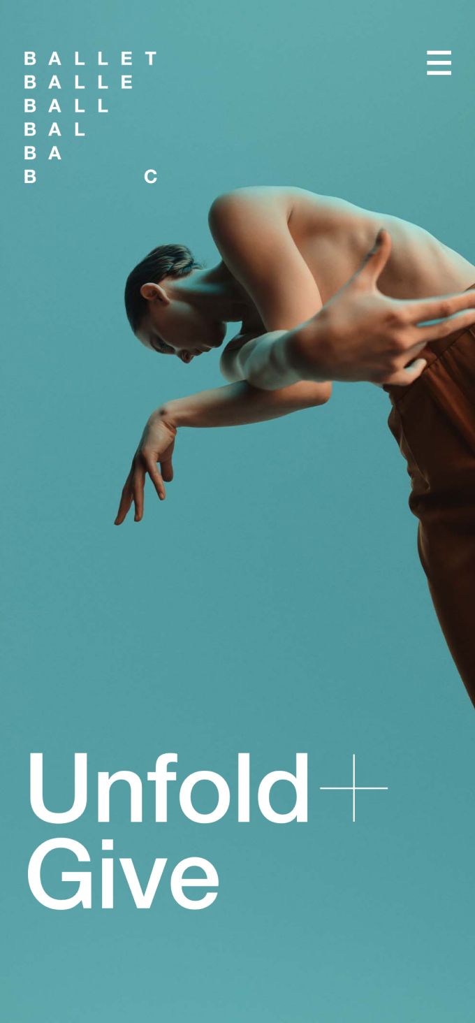
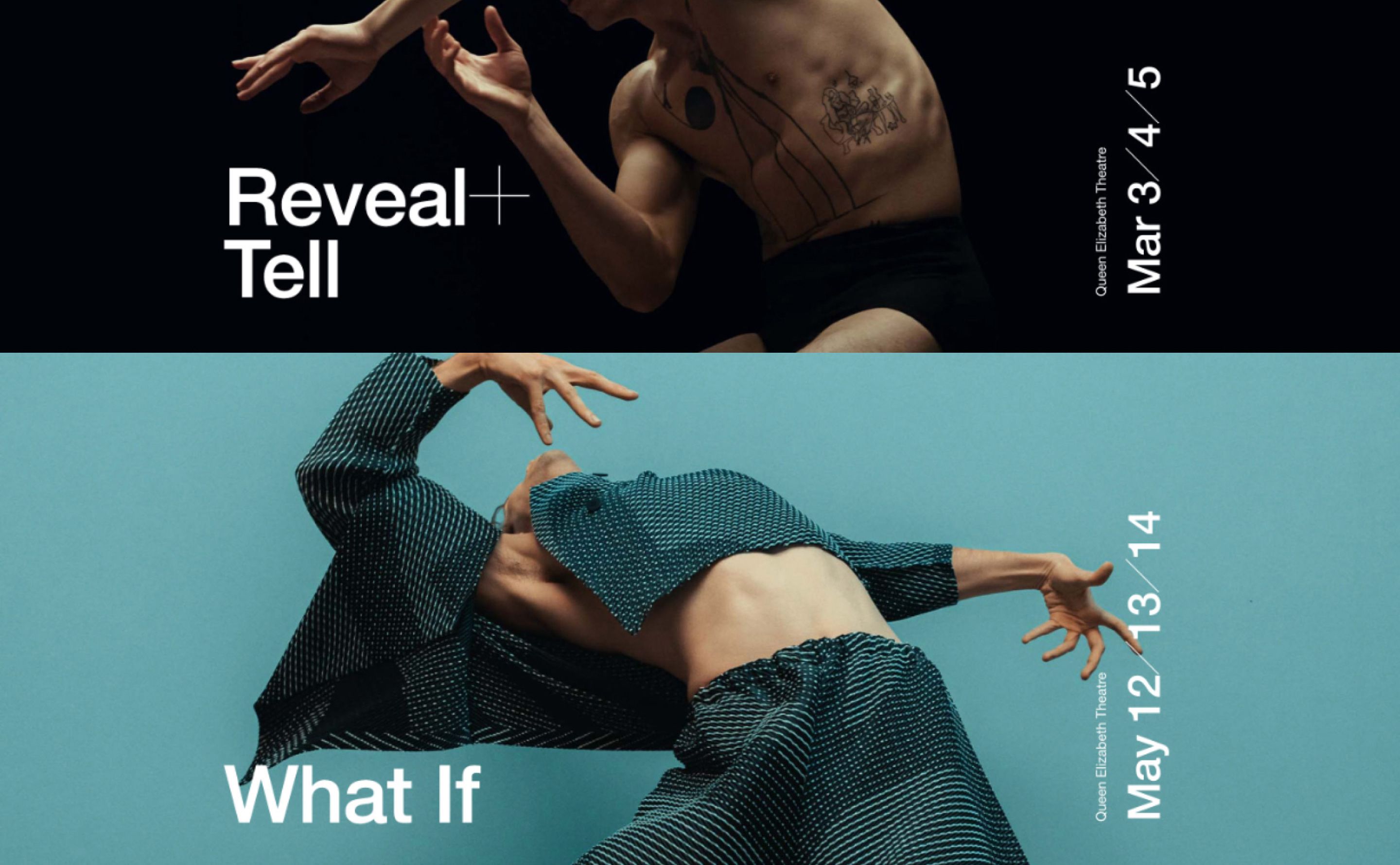
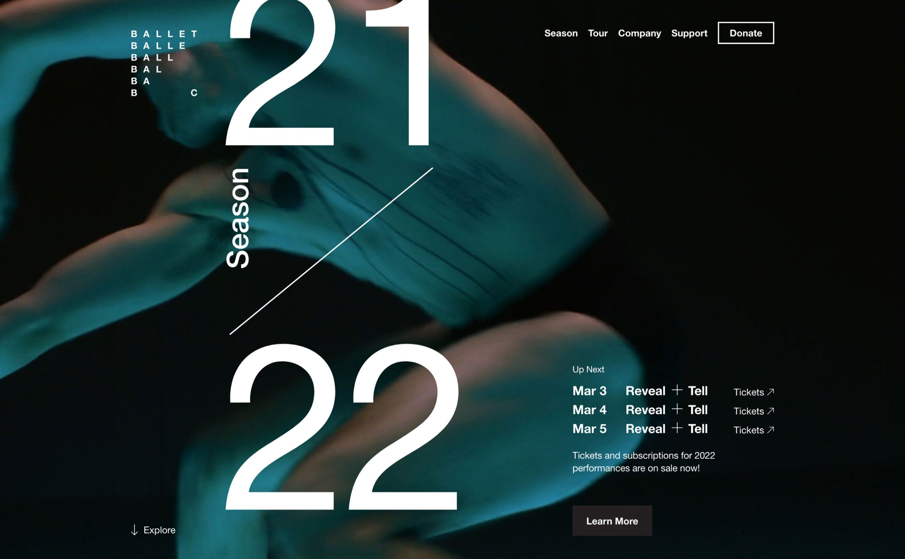
2022/2023 Website

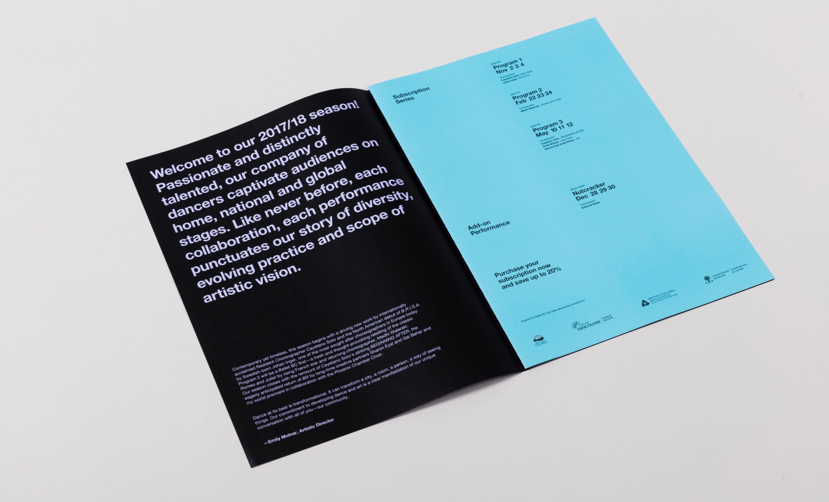
Working closely with Ballet BC leadership, we explored how the brand could viscerally convey the innovative and modern character of the company.

We prepared a highly conceptual and explorative presentation that allowed Ballet BC to participate in an open-ended conversation about how best to encapsulate their unique brand of ballet.


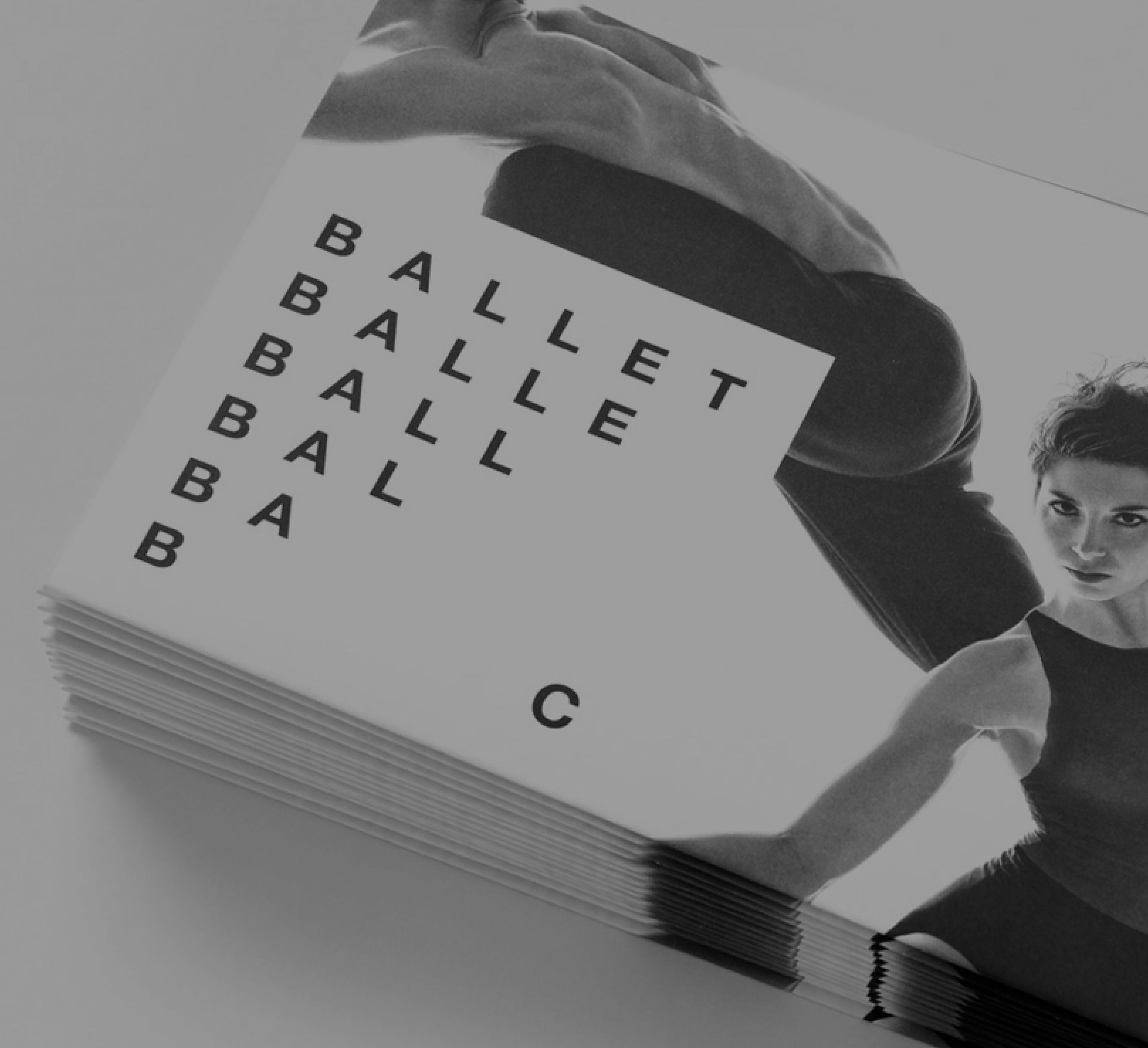
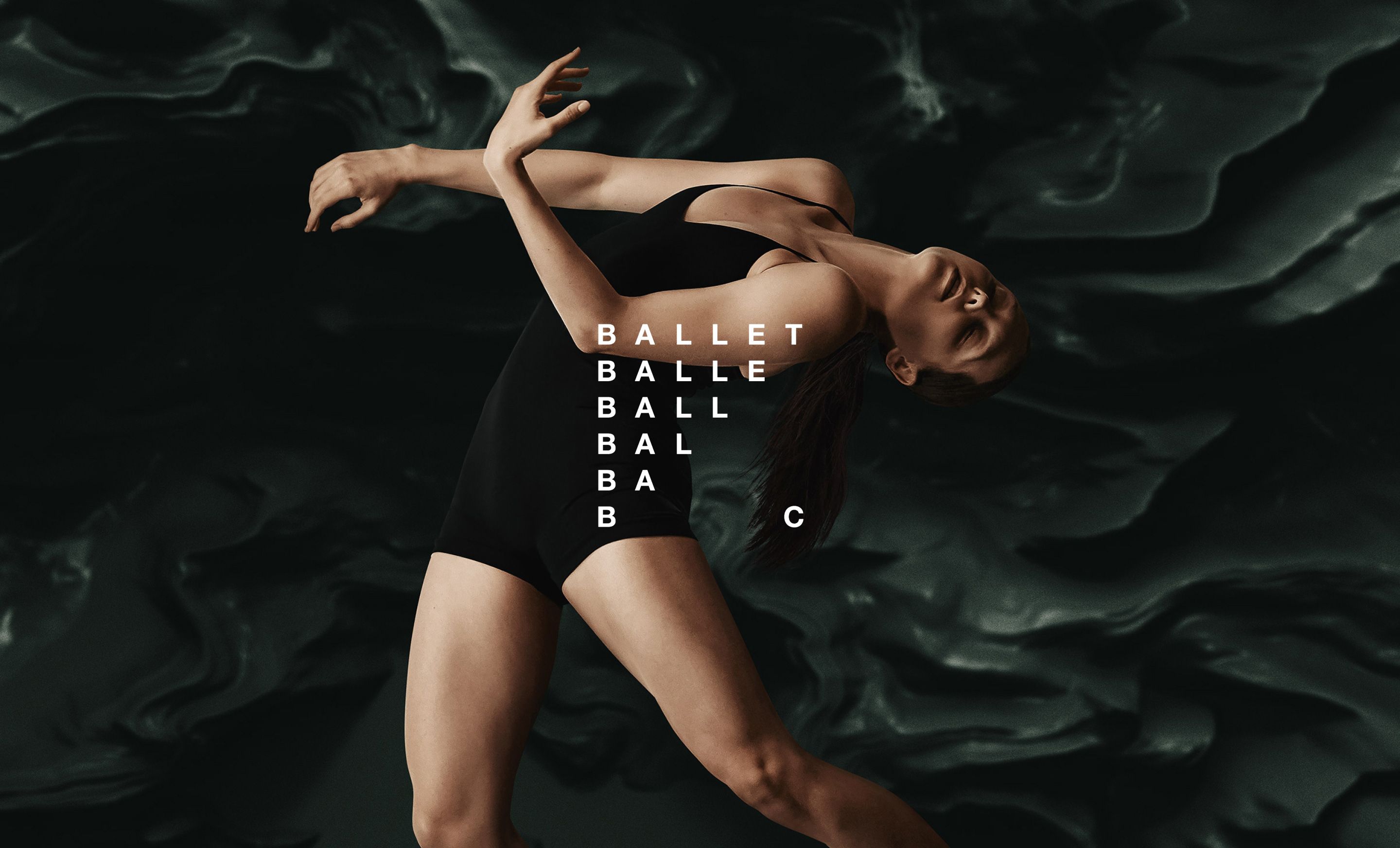
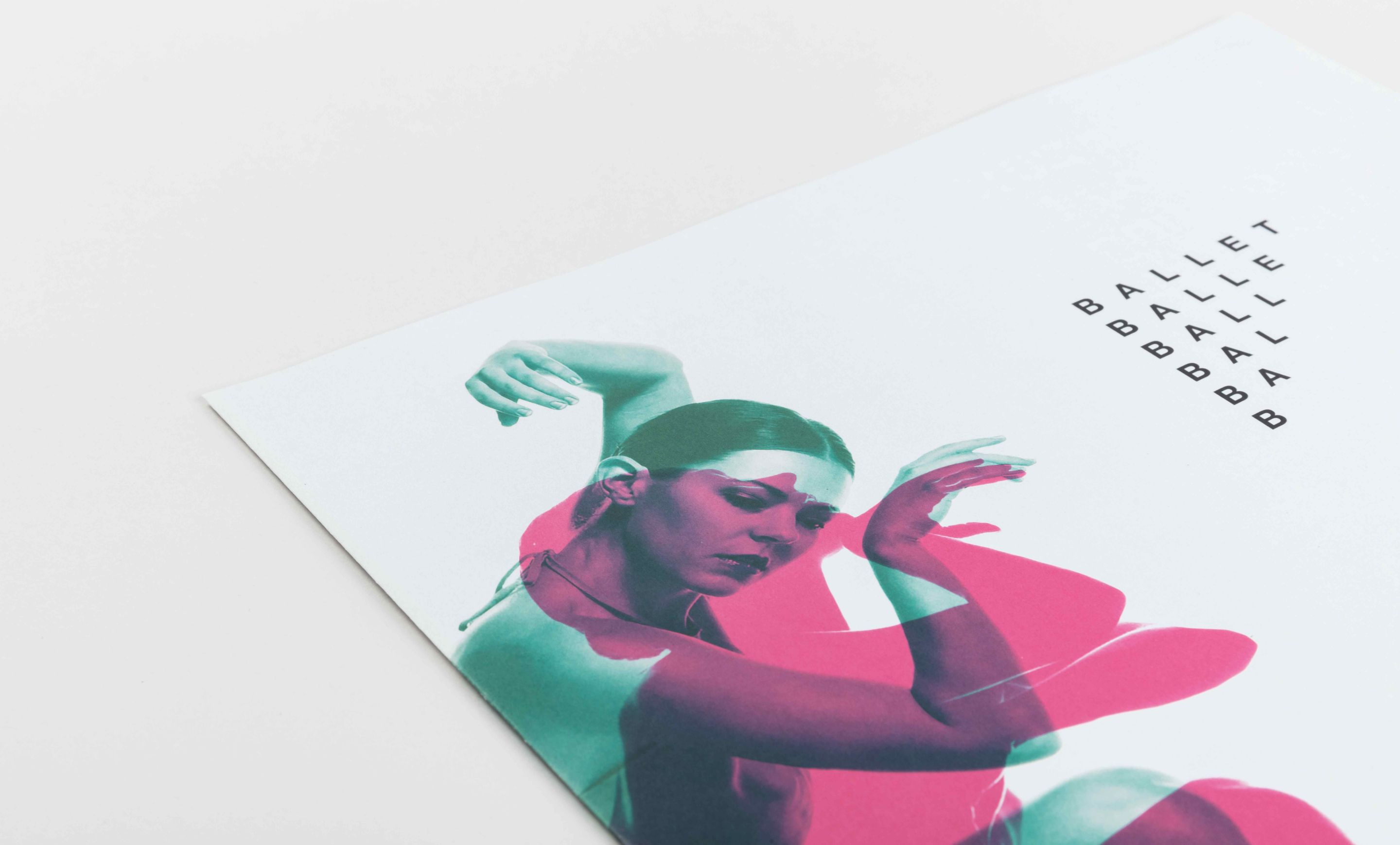
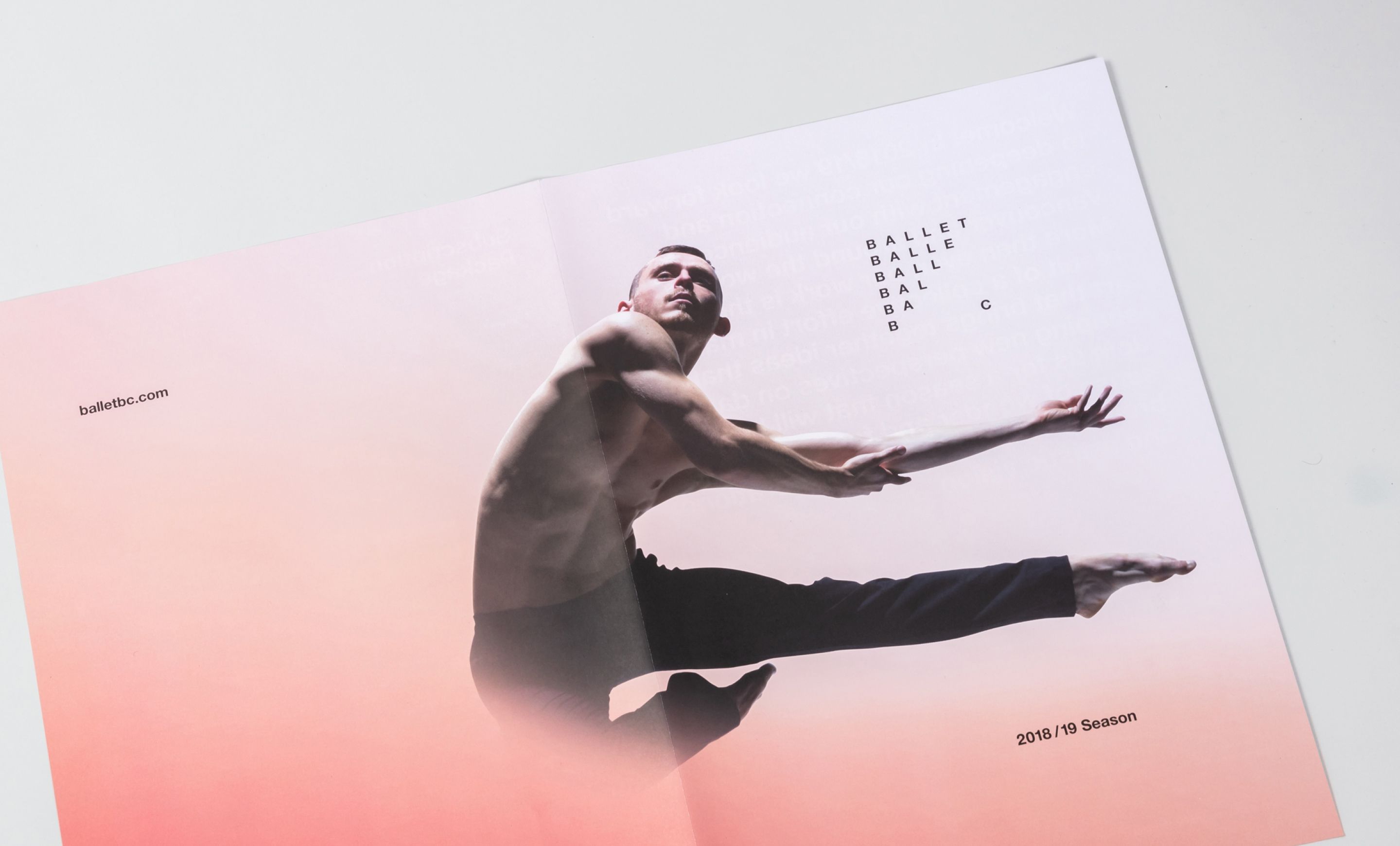
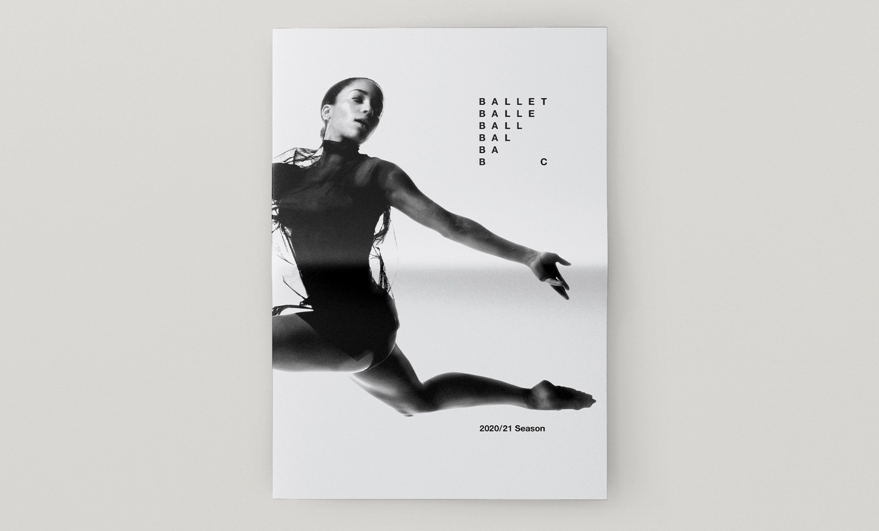
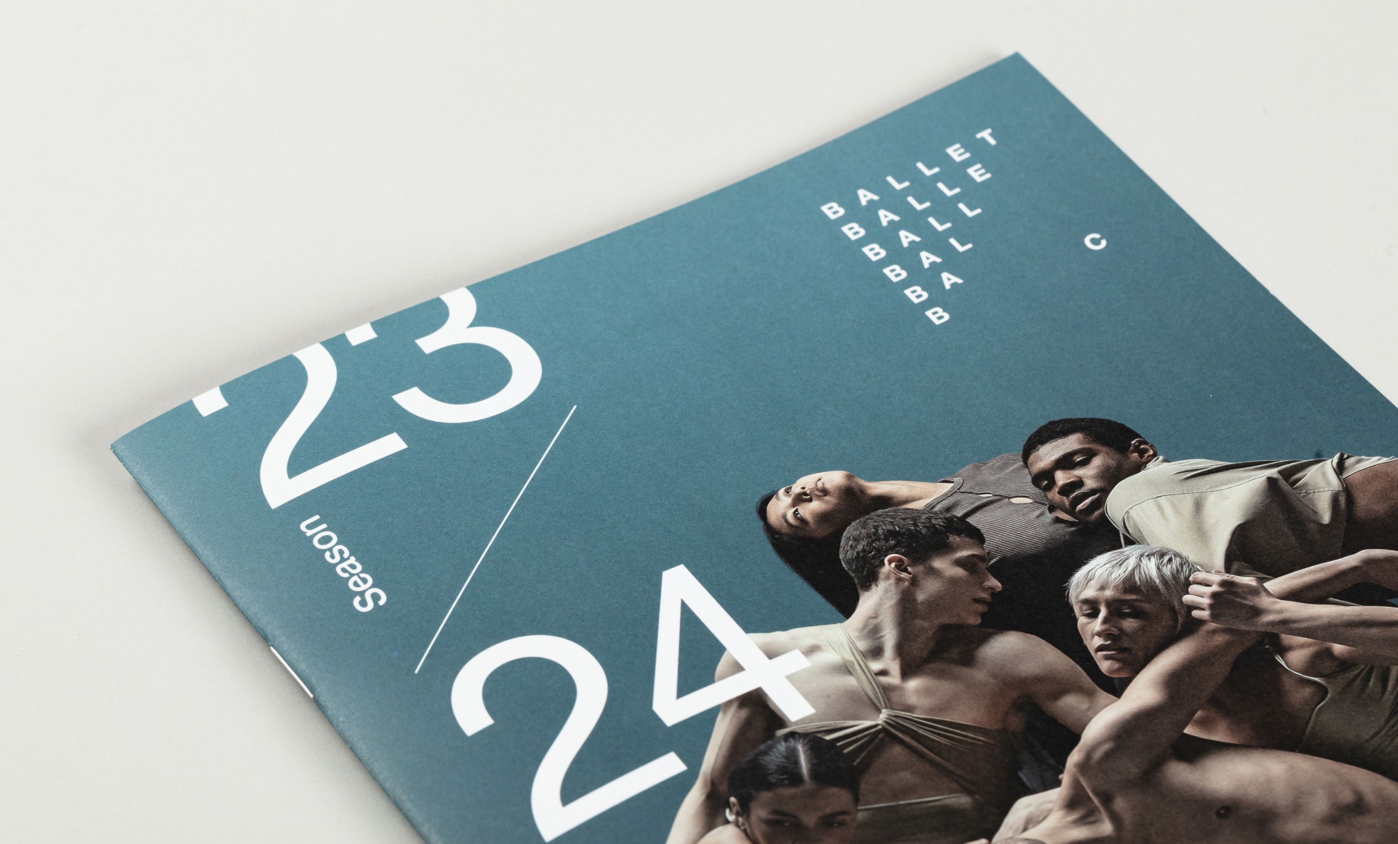
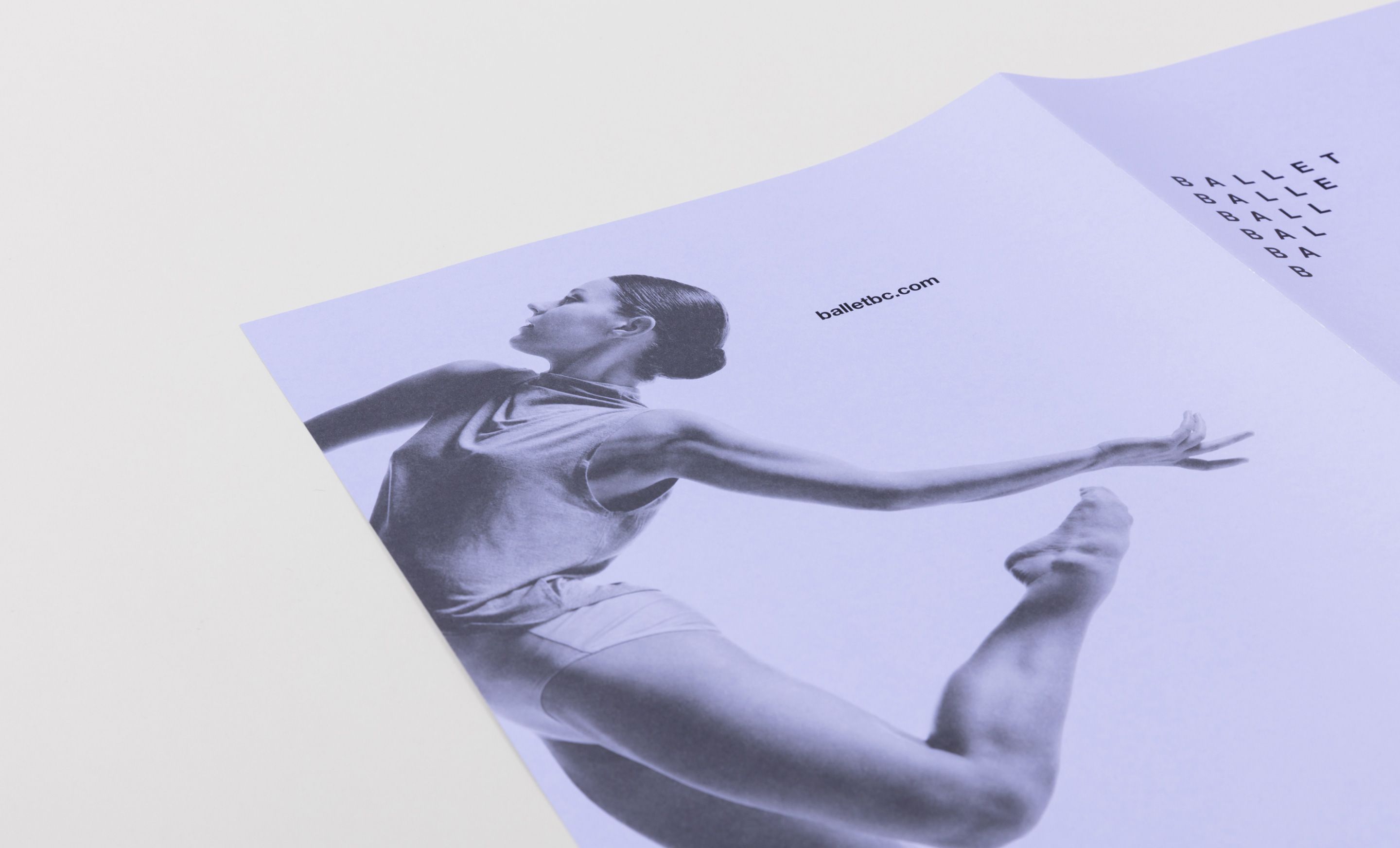
The effect of the iconic Ballet BC logo is one of rhythm and syncopation. It depicts the ensemble and the individual. It primes expectations and delivers surprise.


The Ballet BC typography system is an ode to Helvetica. Graphic standards are carefully maintained with incremental, intentional evolution over several seasons.


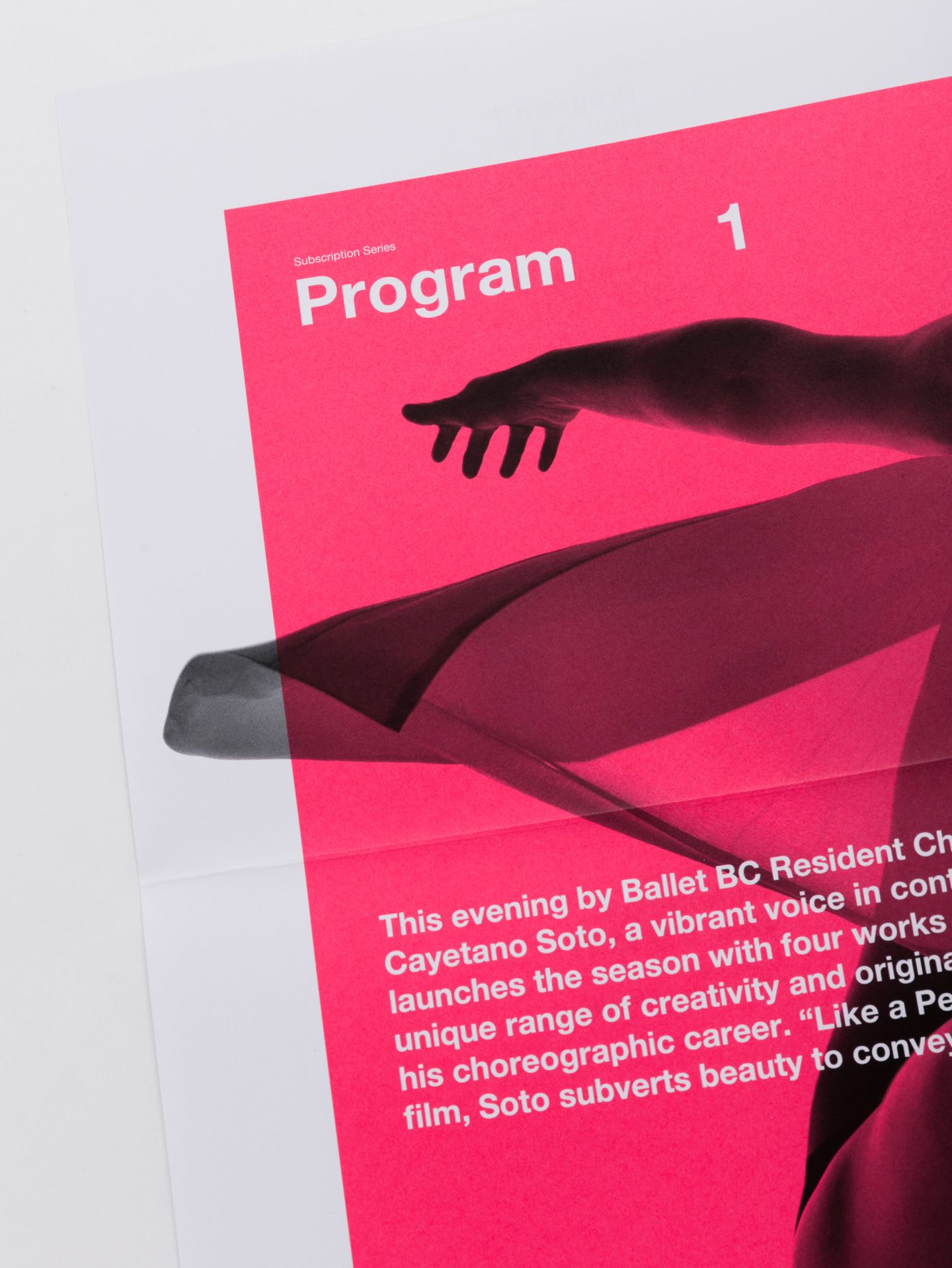
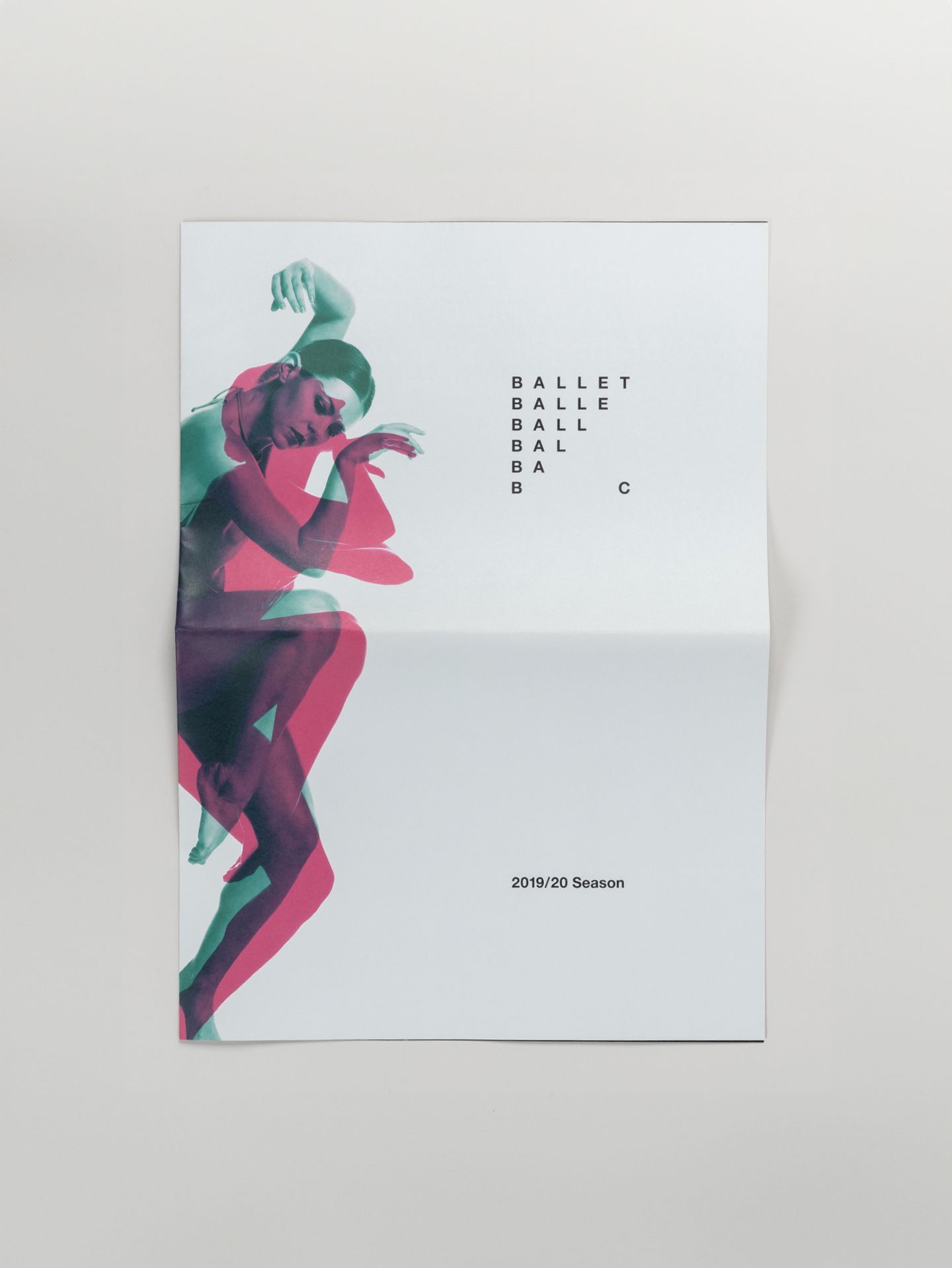
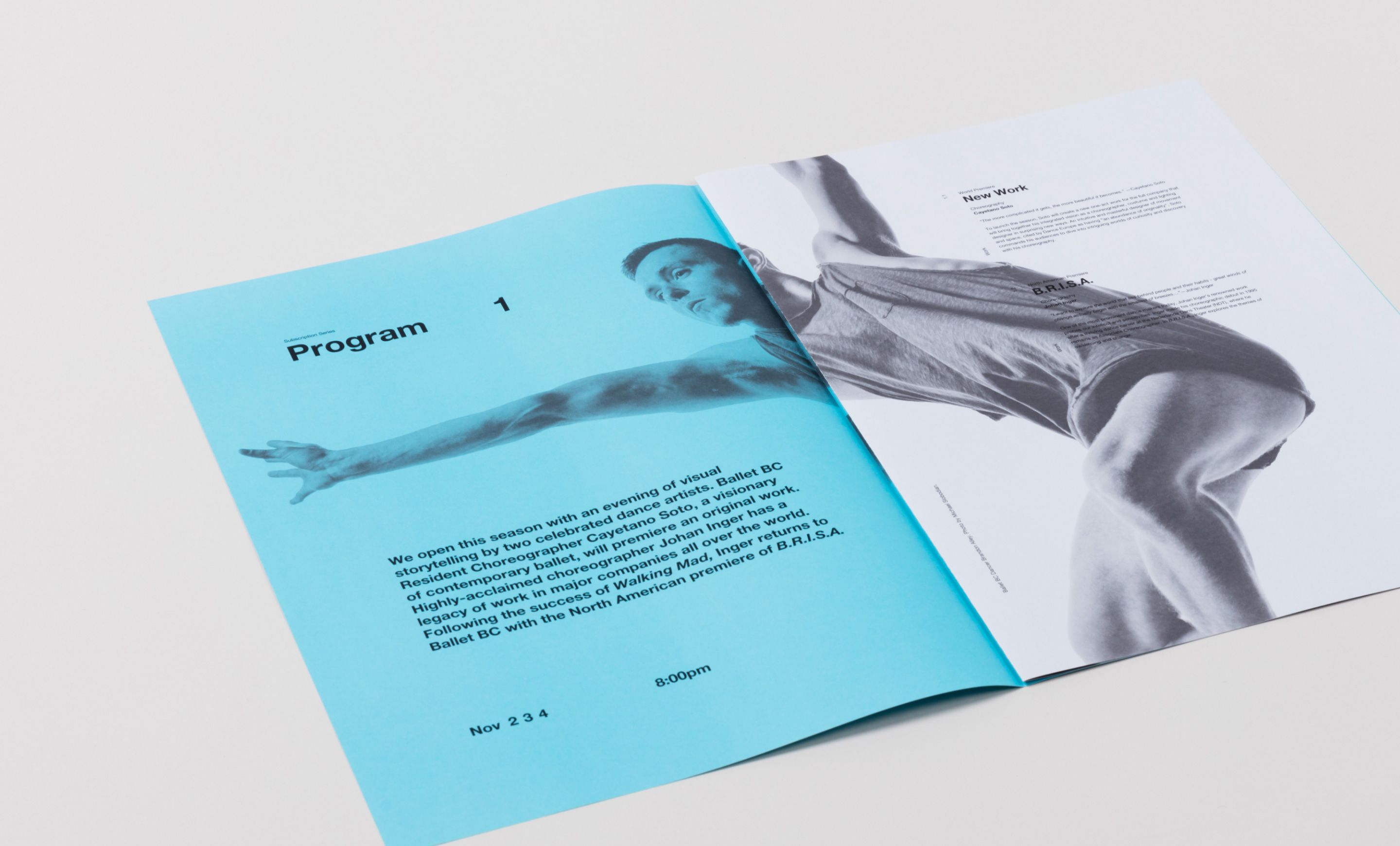
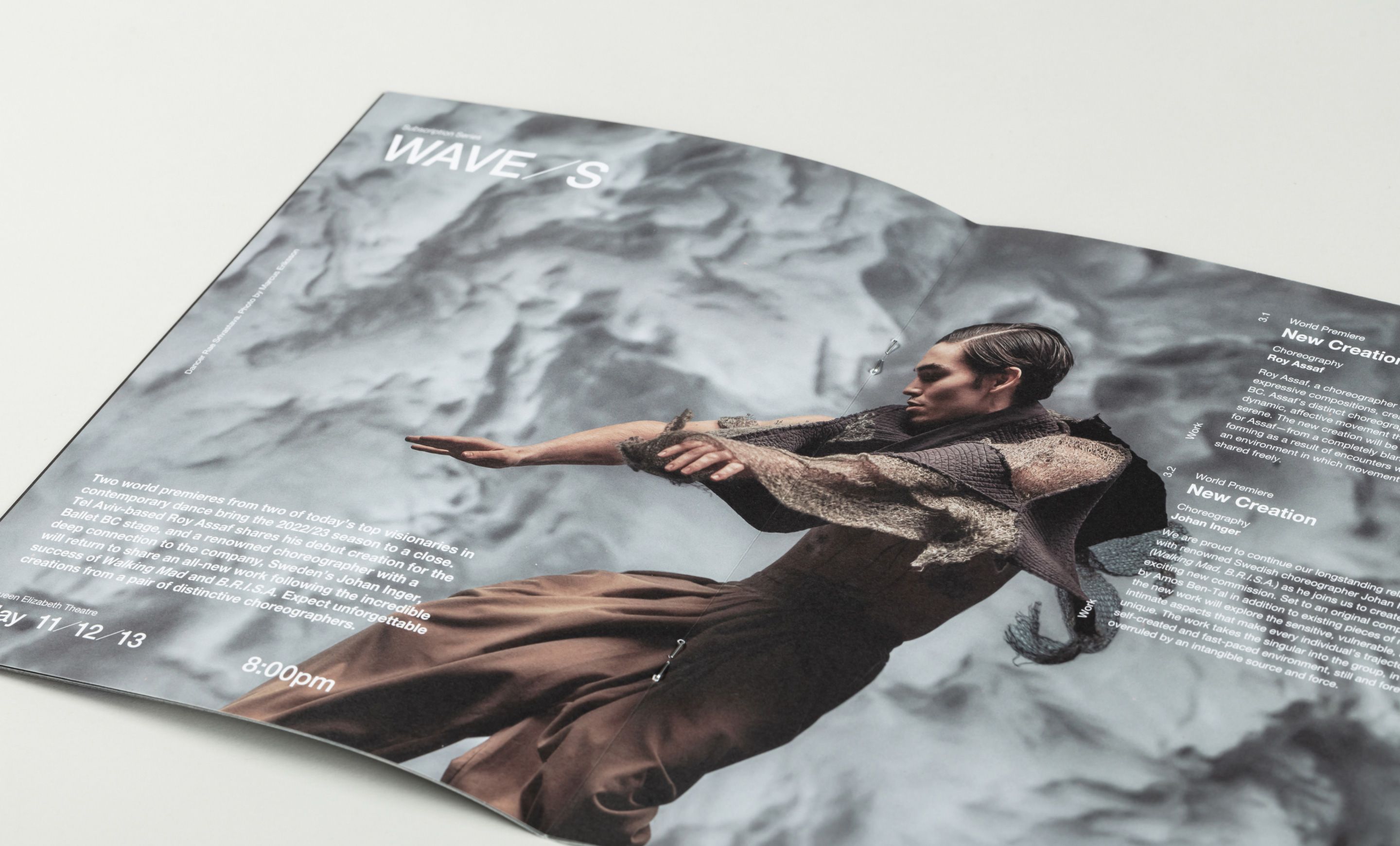
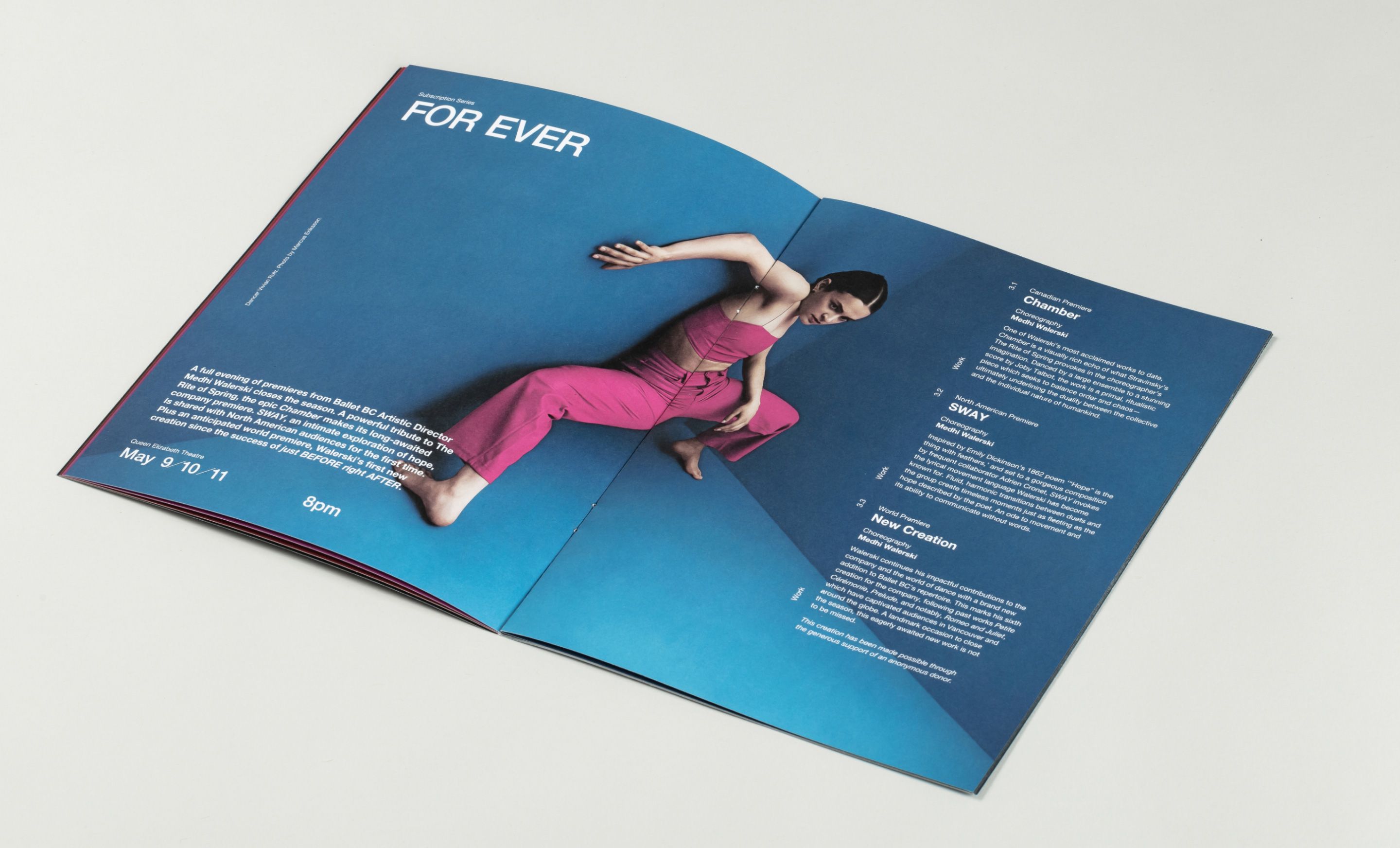
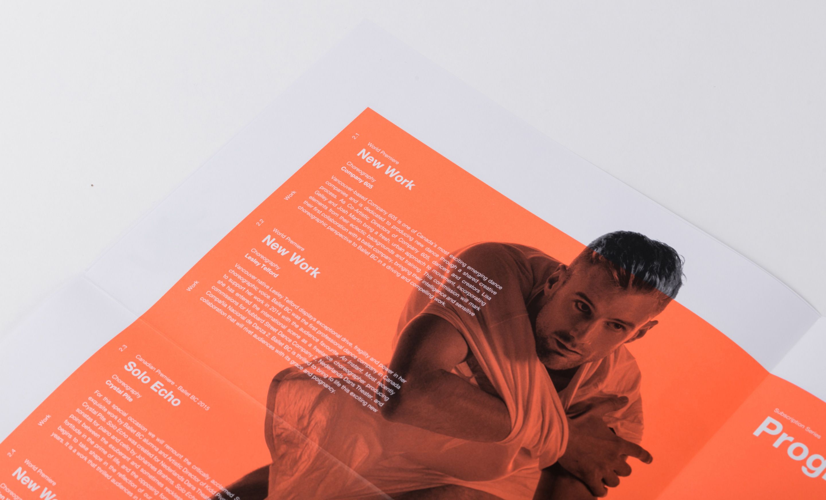
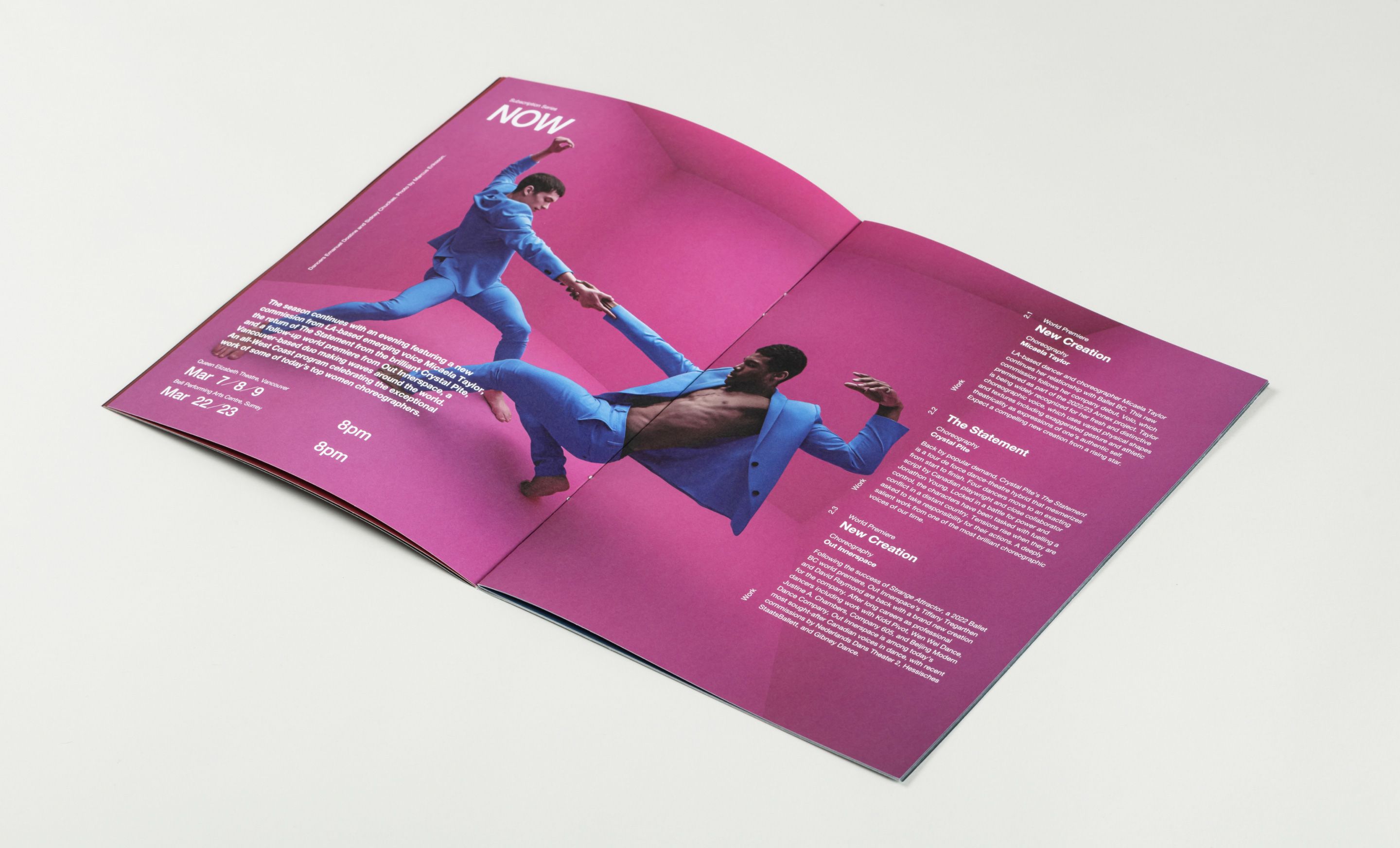
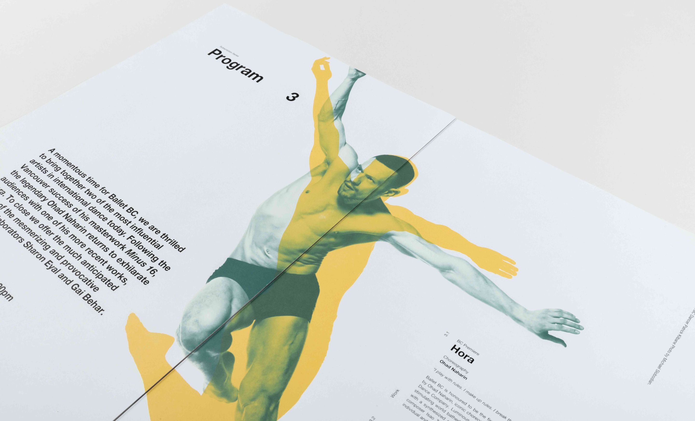
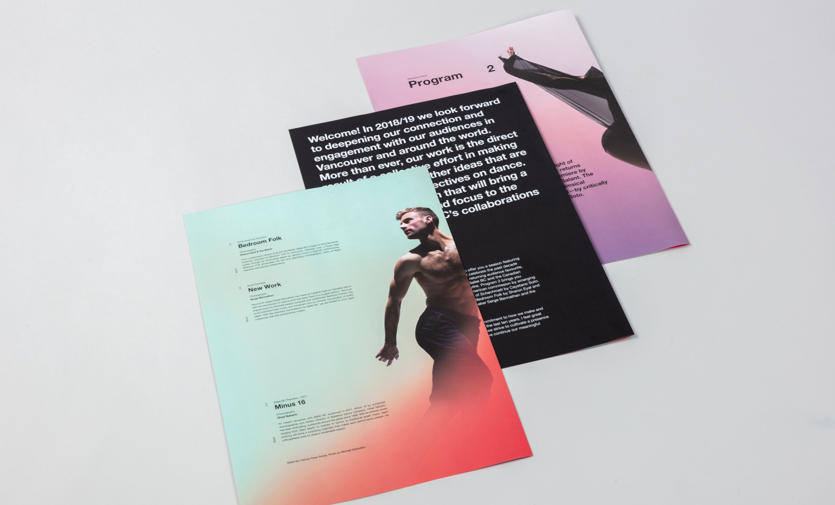


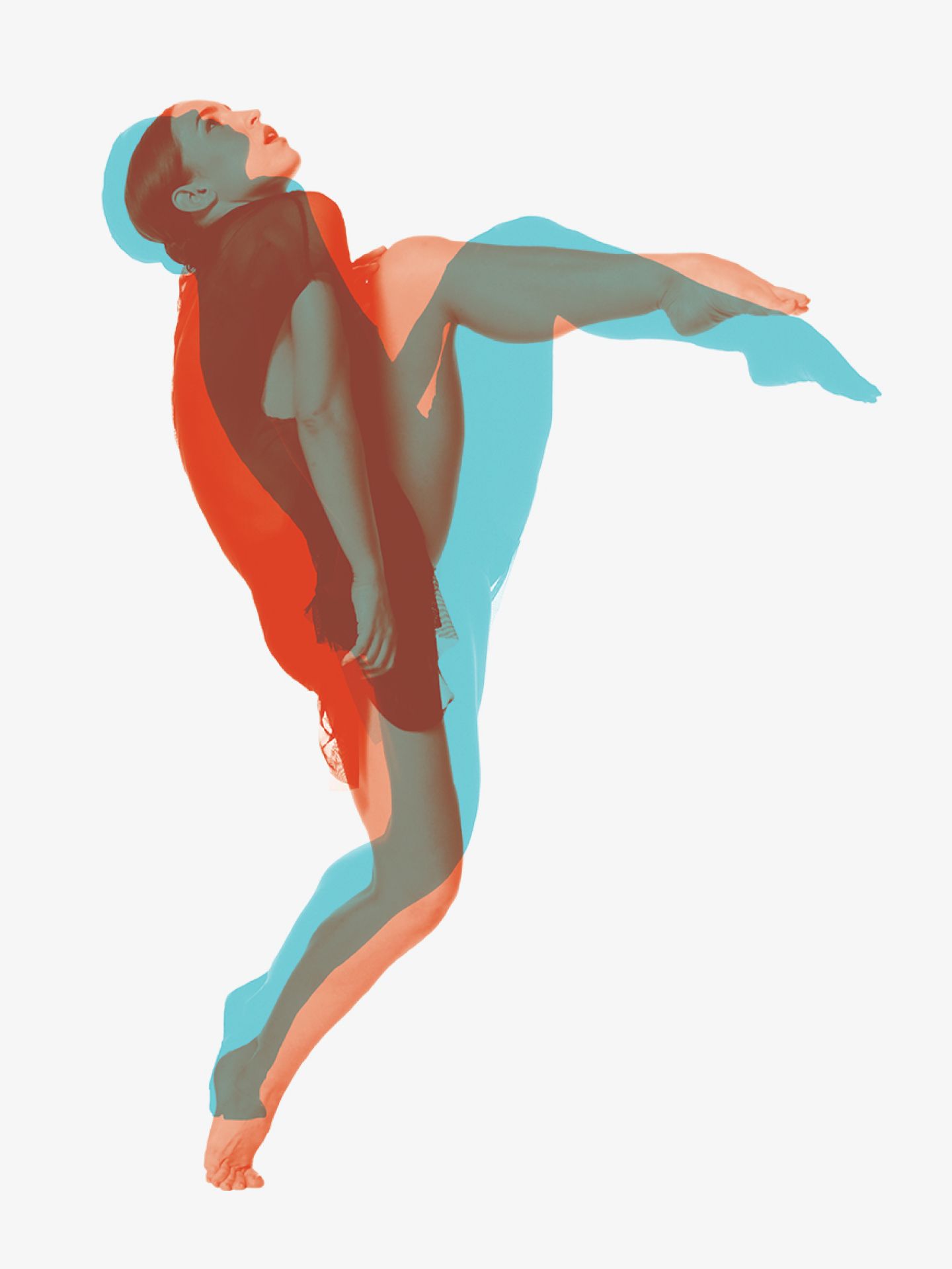


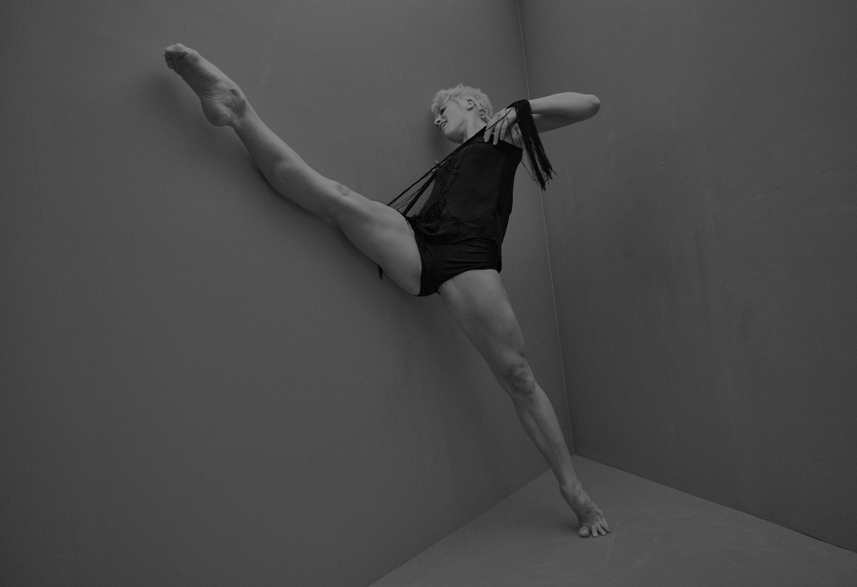
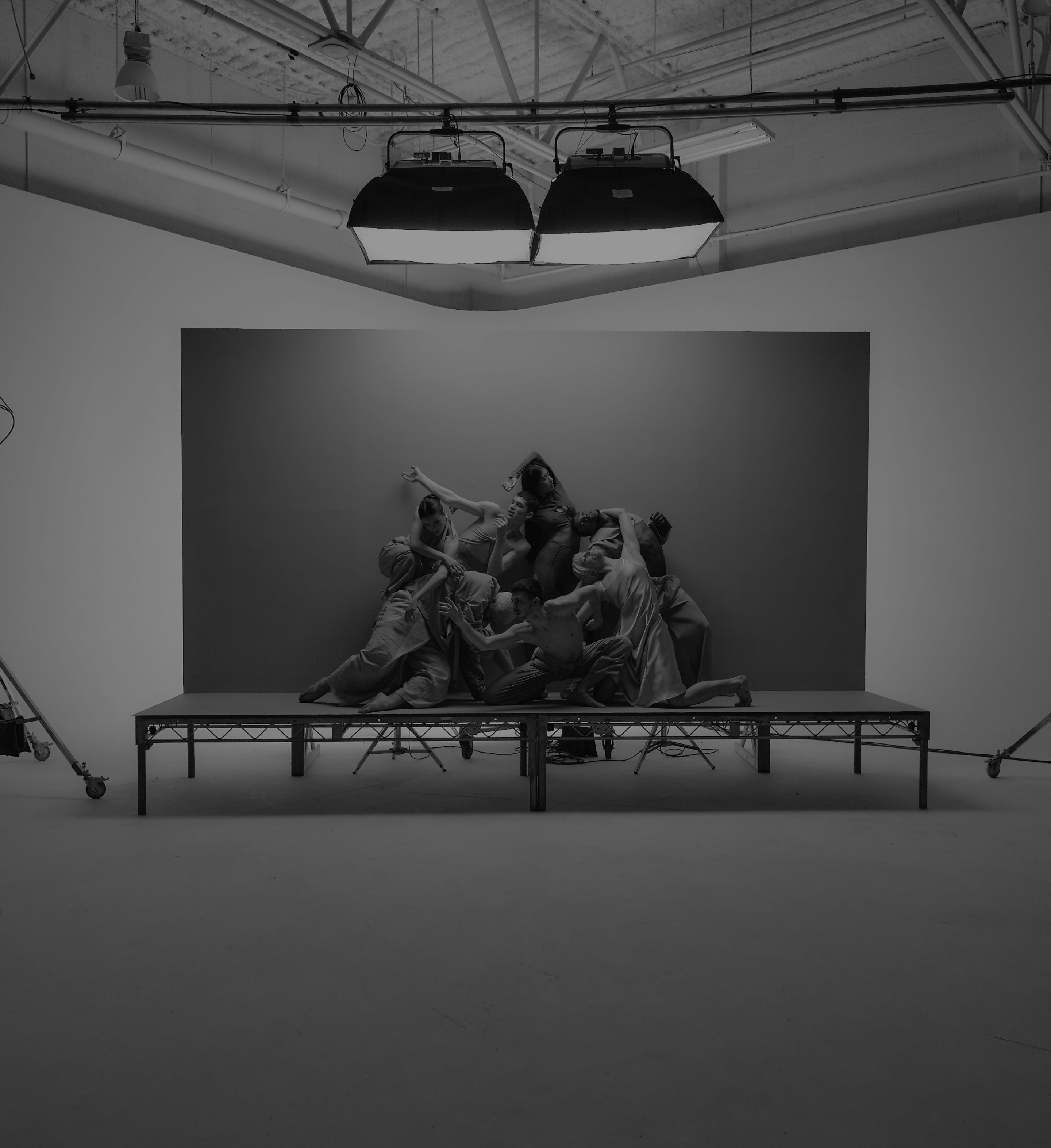
Color and treatment of imagery is refreshed annually and provides for a bold new look to be introduced for each new season.


Burnkit’s branding and design for Ballet BC has been awarded on multiple occasions over many seasons.

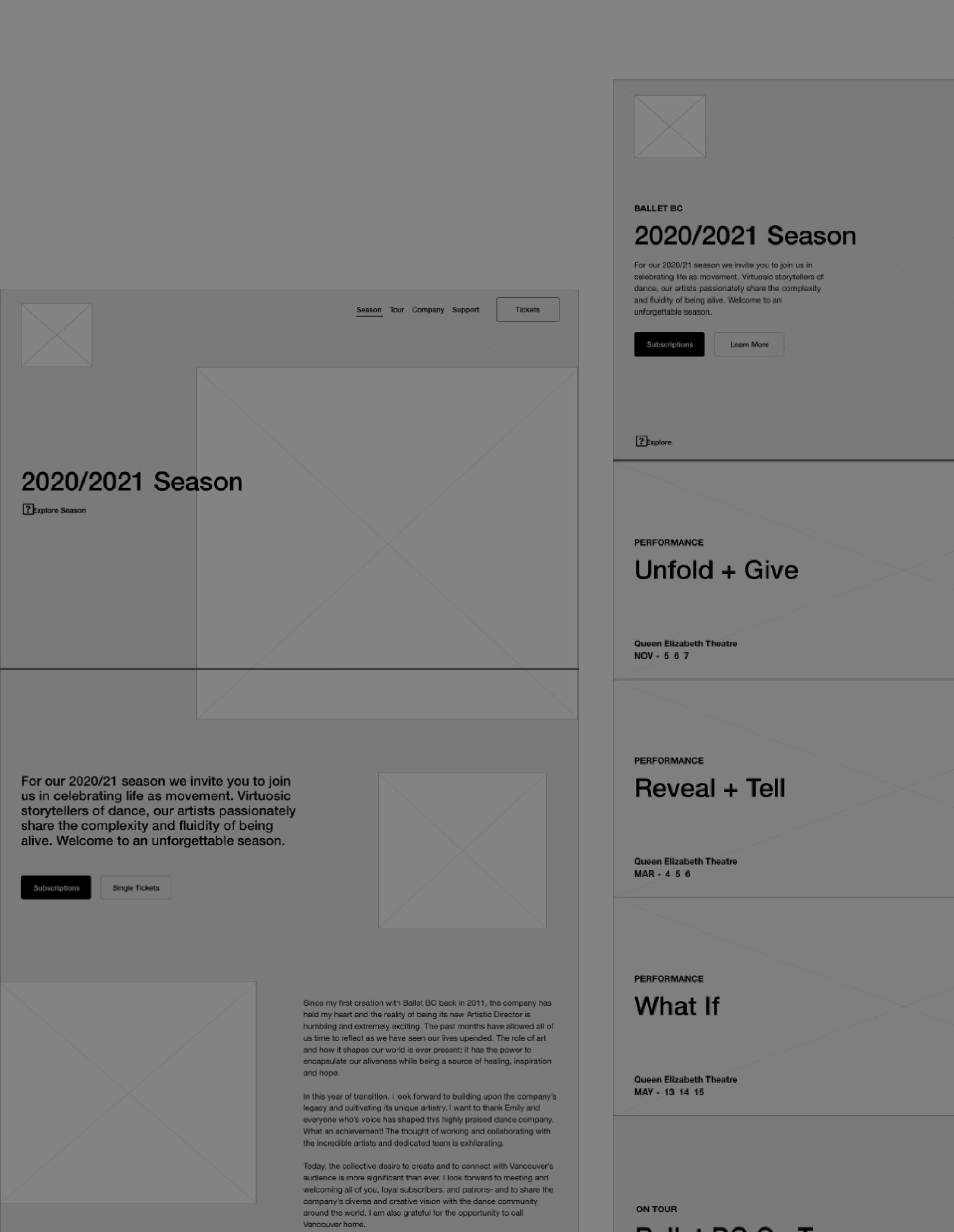
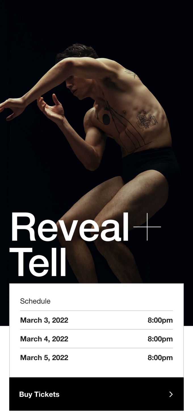
We designed and developed the Ballet BC website to function simply and effectively, while reflecting the creative and expressive qualities of the brand.

View all work
in Arts